
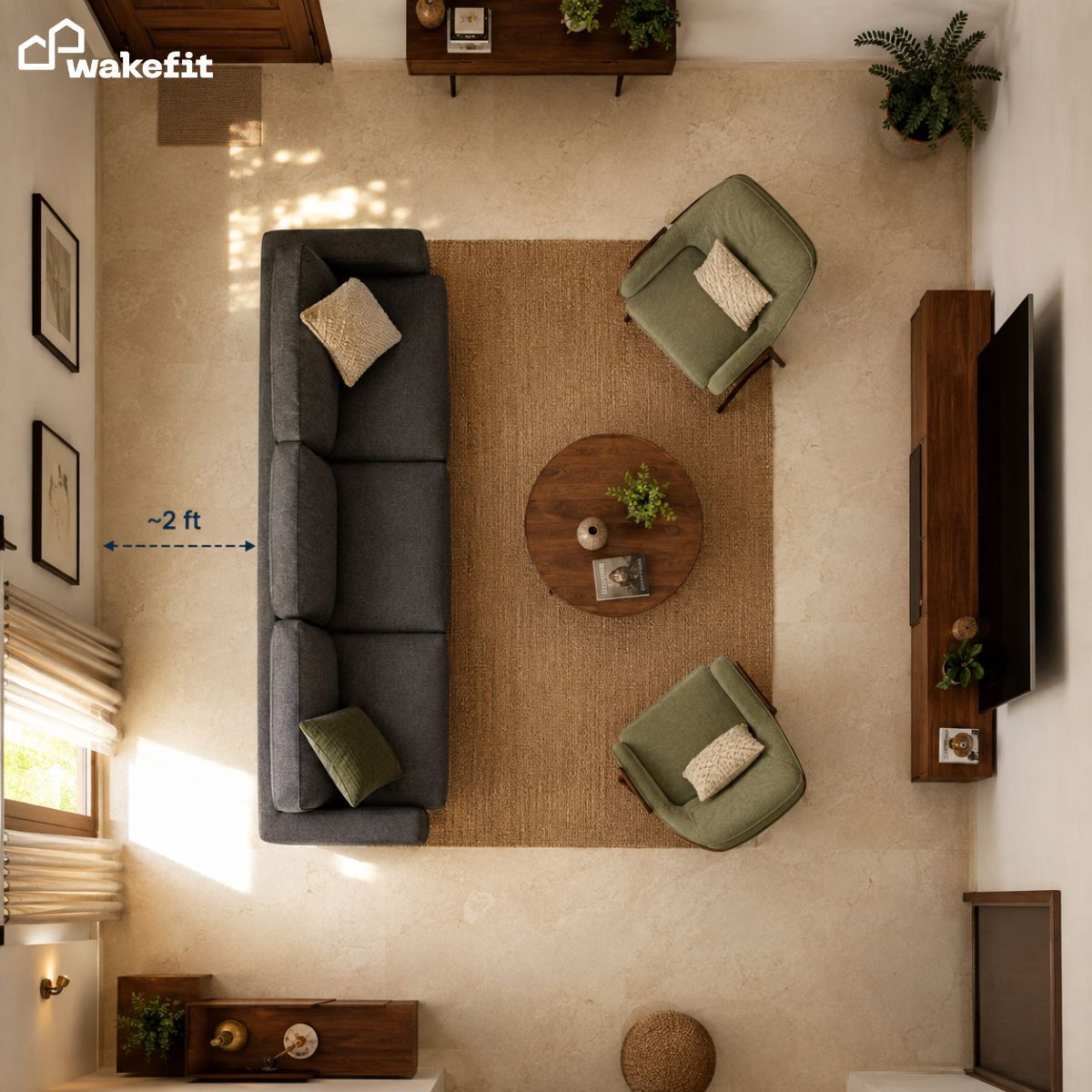

Most people arrange furniture once – when the movers drop everything in – and never change it again. That is the real mistake. In most Indian homes, furniture placement is decided by convenience, not design. And yet, moving your sofa two feet away from the wall, or rotating your bed 90 degrees, can make a 250 sq ft room feel noticeably larger, brighter, and more comfortable – without buying a single new piece.
This guide covers the rules, the room-by-room fixes, and the mistakes that are worth unlearning.
Does moving furniture really change how a room looks and feels?
Yes – and significantly more than most people expect. Furniture layout controls three things that determine how a room feels: perceived space, how light distributes, and conversational flow.
A sofa pushed flat against the wall creates a dead zone in the centre of the room. The same sofa, floated two to three feet away from the wall and anchored with a rug, creates a defined seating zone and makes the room feel like it has a purpose. Nothing else changed – not the sofa, not the paint, not the lighting. Just placement.
Interior designers talk about negative space – the empty areas around furniture. These are not wasted. They are what gives a room room to breathe. When every inch of floor is covered by furniture or squeezed-in walkways, the space feels cramped even if it is not small.
The three things layout directly changes:
- Scale perception – large furniture placed near walls reads as less intrusive; grouped in the centre, it blocks and overwhelms
- Light bounce – furniture placed in front of windows cuts natural light and makes rooms feel permanently dim even on sunny days
- Traffic flow – how you walk through a room determines where the eye lands first
What is the 3-5-7 rule in furniture arrangement?
The 3-5-7 rule is an interior design principle for creating visual balance in any room. It says objects should be grouped in odd numbers – three, five, or seven – because odd groupings feel more natural and dynamic than even ones.
In practice:
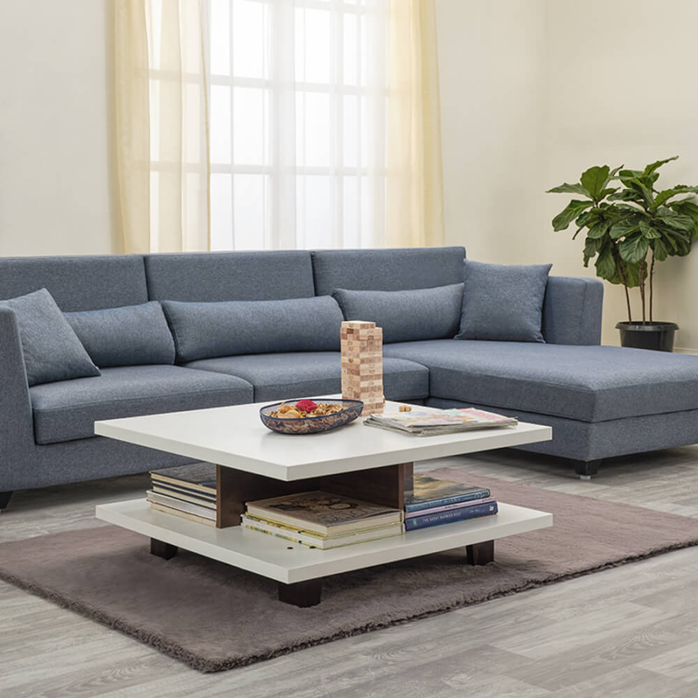
- A coffee table should have 3 objects on it, not 2 or 4 (a tray, a small plant, a candle)
- A gallery wall looks better with 5 or 7 frames, not 6 or 8
- A shelf display works best in groupings of 3 items at different heights – tall, medium, and low
Why odd numbers? Our brains find symmetry predictable. Odd-numbered groupings create a natural focal point because one object always leads the arrangement. The eye settles on it first and then scans outward.
For furniture itself: if you have a three-seater sofa, two single chairs, and a coffee table, you have a 5-piece layout. That feels more balanced than a four-piece matching set or a six-piece arrangement that feels like a furniture showroom floor.
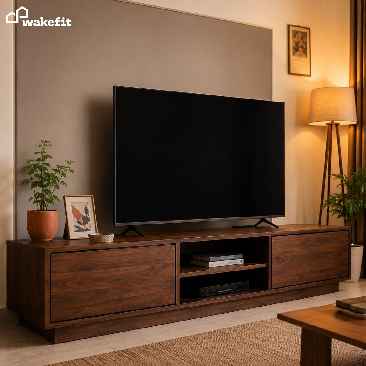
The most practical application in Indian homes is styling a console table or TV unit shelf. Use three objects of different heights: tall (a plant or lamp), medium (a decorative bowl or small stack of books), and low (a figurine or coaster set). It looks deliberate rather than random, even though it took two minutes to arrange.
Should furniture touch the walls or float away from them?
Float it – with one clear exception.
The instinct to push everything against the walls is universal and almost always wrong. It feels like it creates more floor space, but it does the opposite. When all furniture is pressed to the perimeter, the centre of the room becomes a hollow dead zone. The room reads as long and empty rather than comfortable and livable.
In any room over 150 sq ft, leave a minimum two-to-three inch gap between furniture and the walls behind them. In living rooms, float the sofa a full 12 to 18 inches away from the wall and anchor the seating area with a rug underneath it. This creates a zone that reads as intentional.
The one exception: the bed in a bedroom. Placing a bed with the headboard against the wall is standard for good reason – it defines the room’s primary axis, provides back support for reading in bed, and opens up the floor on three sides. Even here, avoid pushing the sides of the bed flush to the side walls. A 12 to 18 inch walkway on each side is the minimum for comfortable daily use.
In Indian 2BHK apartments (typically 800 to 1000 sq ft total), the living room is often the smallest public room. The mistake is treating it like a waiting area – chairs and sofa arranged around the perimeter, TV in the corner, nothing in the middle. Instead: anchor the seating arrangement with a rug, float the sofa to create a conversation zone, and place a console table or bookshelf behind the sofa if the room depth allows it.
What is the biggest furniture placement mistake in Indian homes?
Buying furniture sized for a bigger room.
This is the most common and most expensive mistake. In showrooms, furniture is displayed in large, well-lit spaces. A 3.5-seater sofa looks reasonable in a 500 sq ft showroom. In a 12×14 ft Indian living room, it eats 60 per cent of the usable floor space, reduces the traffic path to under 18 inches, and forces every other piece of furniture against the walls.
The consequences are lasting: the room can never look designed no matter what cushions, rugs, or wall art you add to it. The underlying scale problem prevents any surface-level fix from working.
Before buying any sofa or large furniture, read about the common mistakes buyers make – the most costly ones usually happen before the delivery van arrives.
A close second mistake: blocking natural light. In Indian apartments, windows are often on one or two walls only. Placing a tall bookshelf, wardrobe, or high-back sofa in front of the primary window cuts natural light dramatically and makes the room feel permanently dim. The fix is counterintuitive: put your tallest furniture on the wall opposite the window, not beside it. Let the light travel across the room before it hits anything tall.
How do you create a focal point in your living room?
Every room needs one thing the eye settles on first. Without a focal point, rooms feel restless and directionless – you look around and nothing holds your attention.
In Indian living rooms, the default focal point is the TV. That works if you are intentional about it – the TV unit should be anchored with furniture on either side, artwork or floating shelves above it, and cushions and throws that carry the colour palette from the unit to the seating area.
If you want a non-TV focal point, the alternatives are:
- A feature wall – painted in an accent colour, wallpapered, or panelled in wood or fluted MDF
- A statement bookcase or display unit that covers most of one wall
- A large piece of art – at least 3×3 feet to hold visual weight in an average room
- A large indoor plant (fiddle leaf fig, monstera) in a corner with a directed spotlight from above
The placement rule for focal points: furniture should face the focal point, not sit parallel to it. If the TV is on the north wall, the sofa goes on the south wall facing it. Chairs angle inward at 45 degrees. The coffee table sits centred in the arrangement. When everything in the room points toward one thing, the space immediately reads as designed.
What is the right way to arrange a bedroom so it feels spacious?
Three rules apply to almost every Indian bedroom, regardless of size.
Lead with the bed placement. The bed is the largest piece of furniture and dictates every other placement decision. Headboard against the longest uninterrupted wall, centred if possible, with at least 18 inches on each side for walking. This creates visual symmetry and makes the room feel considered. Read about whether a headboard actually changes the room – it changes the layout geometry as much as the look.
Beds with hydraulic storage built in are worth mentioning here specifically: because they eliminate the need for a separate chest of drawers, one large piece replaces two. In a bedroom under 120 sq ft, a hydraulic storage bed often makes the difference between a room that works and one that feels perpetually crowded.
Wardrobes on the wall with the entry door. Place the wardrobe on the wall that contains the room’s door if possible. This keeps storage connected to the entrance zone, leaves the remaining walls open, and does not interrupt the sight line from the bed.
Keep the foot of the bed clear. The most common Indian bedroom mistake is placing a dresser, bench, or TV unit directly at the foot of the bed. The foot-of-bed zone should have at least 36 inches of clearance for comfortable daily movement. A low bench (under 18 inches) is acceptable; a full dresser or TV table at that position is not.
How do you apply the 2/3 rule when placing furniture?
The 2/3 rule is one of the most practical guidelines in home design. It has two separate applications that both solve common problems.
| 2/3 Rule Application | What It Means | Example |
|---|---|---|
| Sofa vs wall width | Sofa should cover no more than 2/3 of the wall it sits against | 12 ft wall = sofa max 8 ft wide |
| Rug vs seating area | Rug should be large enough for front legs of all seating to rest on it | 3-seat sofa + 2 chairs = at least 6×4 ft rug |
| Artwork vs furniture width | Art above furniture should span 2/3 of the furniture width | Above a 6 ft sofa, art should be at least 4 ft wide |
The rug rule is the one most commonly ignored in Indian homes. A rug that only sits under the coffee table – rather than under the entire seating arrangement – makes the conversation area look disconnected and visually smaller. The rug is what defines the zone. Front legs on, back legs off is the standard that works for most room sizes.
Before buying any large furniture, tape out the footprint on your floor using masking tape. Walk around the taped outline. Imagine sitting in it. You will immediately feel whether the traffic flow works or whether you have been about to make an expensive scaling mistake.
How does light affect which furniture layout works best?
Light changes how a room feels by hour, and furniture placement either works with it or fights it. A layout that looks open in morning sun can feel boxed in by evening. Good furniture placement accounts for both.
Natural light rules:
- Never place tall furniture in front of windows – even a high-back chair blocks more light than you expect
- Glass-top coffee tables and light-coloured upholstery bounce natural light further into the room
- A mirror placed on the wall directly opposite the main window effectively doubles the depth of natural light in the space
Artificial light:
The most common Indian home lighting mistake is one overhead tubelight in the ceiling as the only light source. This creates flat, even illumination that washes out texture and depth. The room looks functional but not comfortable.
Floor lamps and table lamps at different heights create pools of warm light that make the room feel layered. A floor lamp beside the sofa, a table lamp on a console, and a pendant over a dining table each define a zone. When zones have their own light source, the room reads as intentionally designed even before you change a single piece of furniture.
The furniture-light connection: your layout should create zones – a sofa group, a reading corner, a dining area – and each zone should have its own light. This is the difference between a room that feels like an apartment and one that feels like a home.
Which room should you fix first when your home feels cluttered?
The living room, always.
It is the room you spend the most time in, the first room guests see, and typically the room that sets the emotional tone for how the entire home feels. When the living room feels tight and chaotic, the rest of the home feels the same way by association – even if the bedrooms are perfectly arranged.
A step-by-step reset for a living room that is not working:
- Pull everything away from the walls and into the centre of the room
- Identify your focal point (TV wall, window, or feature wall)
- Orient your main seating toward that focal point
- Create a clear 36-inch walkway from the room’s entry to the seating area
- Put the coffee table back, centred in the seating arrangement
- Float the sofa 12 to 18 inches away from the wall behind it
- Add a rug large enough for all front furniture legs to rest on it
Once the living room feels right, the bedroom and other rooms become easier to solve. Often, fixing one room well creates a feeling of order that makes the entire home feel more considered – without touching anything else.
Cushion sizing plays a bigger role in this than most people expect. The right cushion dimensions on a sofa define the scale of the entire seating arrangement – a cushion size guide helps you avoid the common mistake of using cushions that are too small and make the sofa look unfinished.
Does furniture layout really matter more than the furniture itself?
In most cases, yes. A well-arranged room with mid-range furniture looks and feels better than a poorly arranged room with expensive pieces. This is the part of home design that no one tells you when you are buying furniture.
The reason is simple: furniture is what you look at. Layout is what you feel. When the arrangement is right – sight lines are clear, zones are defined, traffic flows naturally, and light is not blocked – your brain reads the space as comfortable and ordered. When the arrangement is wrong, even the best sofa or the most expensive wardrobe cannot fix the feeling.
The most transformative changes in any Indian home are almost always free: rotating the bed, floating the sofa, clearing the foot-of-bed path, or repositioning the dining table away from the kitchen wall. These changes cost nothing and take an afternoon. The results usually last years.
Start with one room. Make the changes. Live with it for a week. The difference in how you feel in that space will tell you exactly which room to fix next.
Frequently Asked Questions
What is the 3-5-7 rule in interior design?
The 3-5-7 rule says objects should be grouped in odd numbers – three, five, or seven. Odd groupings feel more natural and dynamic because one item always leads the arrangement. Apply it to shelf displays, gallery walls, and coffee table styling.
What is the 2/3 rule for furniture?
The 2/3 rule means your sofa should cover no more than two-thirds of the wall it sits against. It also applies to rugs (should cover 2/3 of the seating area) and artwork (should span 2/3 of the furniture width below it).
Should furniture touch the walls?
No – for most furniture. Floating sofas and chairs 12 to 18 inches away from walls creates a defined zone and makes the room feel more spacious. The one exception is the bed’s headboard, which should rest against the wall for visual structure and back support.
How do I make a small Indian living room look bigger?
Choose a sofa that fits the 2/3 wall rule (not an oversized 3.5-seater), float it away from the wall, use a large rug to anchor the zone, place tall furniture on the wall opposite the window, and add a mirror on the window wall. These five changes work in most Indian 2BHK living rooms.
What is the biggest furniture placement mistake?
Buying furniture sized for a larger room. The mistake happens in showrooms where furniture is displayed in 500+ sq ft spaces. The fix: measure your room first, apply the 2/3 rule, and tape out the footprint on your floor before purchase.
Where should the sofa face in a living room?
Toward the focal point – which is usually the TV wall, a feature wall, or the main window. Furniture should face the focal point directly, not sit parallel to it. Chairs should angle inward at 45 degrees to complete the conversation arrangement.
How much space should be between furniture?
Walkways should be a minimum of 36 inches wide for comfortable movement. Between a sofa and coffee table, keep 12 to 18 inches – enough to reach the table easily without standing up. Between beds and side walls, keep at least 18 inches on each side.
Where should a wardrobe be placed in a bedroom?
On the wall that contains the bedroom entry door, if possible. This keeps storage connected to the entrance zone, leaves the other walls clear, and avoids interrupting the sight line from the bed. Avoid placing the wardrobe on the wall opposite the bed – it fills your first view of the room every morning with a large vertical surface.
No Comments